Explaining the benefit of replication

It is well known that replicating a scientific experiment usually leads to a more conclusive result. One way in which this happens is that the statistical evidence becomes stronger when it is accumulated across many experiments. What is perhaps surprising is that describing and quantifying how this happens is not straightforward. Simple explanations can easily be misinterpreted if they gloss over key details.

Confusion due to ambiguity

One explanation I heard recently went roughly as follows:

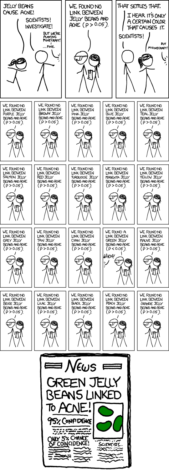
Suppose we run a single experiment, using the conventional 5% level of statistical significance. A positive finding from this experiment will be wrong 1 out of 20 times. However, if we were to run three experiments instead of just one, the chance that all of them would be wrong would be 1 in 8,000 \((= 20^3)\).

The fact that is being explained here is that the false positive rate is decreasing. That is, if we assume the underlying research hypothesis is actually false, the chance that a single experiment will come out positive (i.e. will support the hypothesis based on a statistical test) is 1 in 20, and the chance that all three experiments will do so is 1 in 8,000.

However, most people are likely to interpret the statement differently. They will mistakenly think that the chance the research hypothesis is true, given a positive finding, is 1 in 20.

The difference is somewhat subtle. The first interpretation refers to the probability of the experimental outcome given an assumption about the truth of the research hypothesis. The second is the reverse, a probability of the hypothesis given an assumption about the outcome. The two can easily be confused, giving rise to what is known as the Prosecutor’s fallacy.

The main problem is the ambiguity of the phrase ‘will be wrong’, which can be interpreted in different ways. Most people would naturally focus on the main question of interest (‘is the hypothesis true?’) whereas classical statistics is usually posed in the reverse manner (‘what is probability of the data given the hypothesis?’). We can attempt to fix the explanation by more precise wording, for example:

Suppose we run a single experiment, using the conventional 5% level of statistical significance. If the research hypothesis is not true, the experiment will give rise to a positive finding by chance 1 in 20 times, while with three independent experiments the chance that all three would be positive goes down to 1 in 8,000.

While this is now factually correct, the message has become a bit harder for a lay audience to understand or relate to. They will want to know how replication helps to answer the question of interest. They may even impose their own interpretation of the probabilities despite the careful wording. Prosecutor’s fallacy still lurks in the shadows.

More meaningful explanations

To help such an audience, we can frame the explanation directly in terms of the chance that the hypothesis is true. This requires some extra information:

  1. The statistical power of the experiment (also known as the sensitivity or the true positive rate). This is the chance that it will give a positive result if the research hypothesis is true.

  2. The prior probability of the hypothesis. This is our best assessment of whether the research hypothesis is true before having run the experiment, summarised as a probability. (This can be based on other evidence already gathered for this hypothesis, or on evidence or experience from studies of similar or related hypotheses.)

After we conduct the experiment, we can combine the outcome and the above information together using Bayes’ theorem to determine the posterior probability of the hypothesis. This is our ‘updated’ assessment of it being true, in light of the evidence provided by the experiment. It is this quantity that is of most interest to the audience, and how it would differ if replicate experiments are conducted.

For example, suppose we wish to run a psychology experiment that is somewhat under-resourced and we have assessed the power to be about 20%. Furthermore, let’s suppose we are testing a speculative hypothesis and rate the chances of it being true at about 1 in 10. A positive finding in this case would upgrade this to about 1 in 3 (a posterior probability of about 33%), which still leaves plenty of room for doubt. If we replicate the experiment two more times, and get positives each time, then the overall posterior probability would be almost 90%. This would certainly look more convincing, although perhaps not completely conclusive.

In comparison, suppose we are planning a clinical trial with a power of 80%. We will test a drug for which we already have some evidence of an effect, rating the chances of this being true as 1 in 3. A positive outcome here already entails a posterior probability of almost 90%, while positive outcomes for three independent such trials would raise this to more than 99.9%.

Note that in both of these examples I have assumed the experiments would be designed to have a 5% false positive rate, as is commonly done. That means for both examples the false positive rate for three experiments is 1 in 8,000. However, the quantifiable impact on the actual question of interest varies.

Recommendations

The above examples show how to explain the impact of replication on the statistical evidence in a way that is more understandable than if only referring to the change in the false positive rate.

I recommend using an example along these lines when communicating the benefit of replication. Tailoring the example to the audience’s interests, including using assumptions that are as realistic as possible, would allow them to more easily see the relevance of the message. Even for a fairly general audience, I recommend describing a hypothetical experiment than referring to generic statistical properties.

Setting up this type of explanation requires some elaboration of key assumptions, such as power and prior probability, which can take a bit of time. The reward is a meaningful and understandable example.

While it might be tempting to resort to the ‘1 in 8,000’ explanation to keep the message brief, I recommend against it because it is likely to cause confusion.

If brevity is very important, I recommend steering away from numerical explanations and instead just describing the basic concepts qualitatively. For example, ‘replicating the experiment multiple times is akin to running a single larger experiment, which naturally has greater statistical power’.

Making bold and italics work in Slidify

Last week I gave a talk on how to make R packages (see my previous post). Given the topic, I though it would be quite appropriate to actually make my slides using an R package!

After considering the options, I decided on Slidify. This is essentially a nifty wrapper to other libraries and HTML presentation frameworks. Its default framework, io2012, looked great so I stuck with it.

Making the slides was quick and easy: I wrote my content in R Markdown and ran slidify() to compile it into a slick web-based slide deck. It was particularly simple to include R code and have it presented with nice syntax highlighting, as well as show the output of R commands (including plots!).

Although Slidify is relatively mature, there were a few wrinkles that I needed to iron out before I was happy with my slides. One of these was that emphasised text (bold and italics) didn’t display properly using io2012. This is actually a known, long-standing bug, but has an easy workaround. You simply need to define the following CSS styles:

em {
    font-style: italic
}
strong {
    font-weight: bold;
}

You could embed these rules inside your R Markdown code if you like (by wrapping them inside <style>...</style>), but I prefer to add them as a separate file. Slidify makes this straightforward: just create a CSS file inside assets/css with the above rules and it will automatically be included when you compile your slides (in your header make sure you set the mode page property to selfcontained, which is its default value).

Writing and managing R packages

Last week I gave a talk about writing R packages to the Melbourne R user group. I’ve made my slides available online. You can also download the code from the example package I used.

I wanted to show how easy it is to make a basic package, and only a little more effort to add some standard documentation. Modern development tools, in particular the devtools package, have made the whole process efficient and straightforward. If you are used to a workflow where you put shared code in a file such as functions.R that you then source() elsewhere, then this talk is for you.

Our future in big data science

I gave a talk today at the Young Statisticians’ Workshop hosted by the Canberra Branch of the Statistical Society of Australia. Although the event was aimed at those early in their statistical career, I chose a topic that is relevant for all of us: how ‘big data’ and ‘data science’ relate to our profession and how we can equip ourselves to be actively involved.

My talk covered some similar ground to a talk I gave last year at the University of Melbourne. That one targeted academic statisticians in particular and discussed how I think statistical education needs to change. In contrast, I aimed today’s talk at students & recent graduates and suggested ideas on how to kick-start a career as statistician and data scientist. See my slides for more details.

Get your KIR types here

Last week we published a major paper in the American Journal of Human Genetics. This is one of the main projects I’ve been working on at MCRI and it is fantastic to finally have it out.

Briefly, we developed a statistical method that can infer the genetic types of a particular group of immune system genes, based on other genetic information nearby. This will be an important tool in allowing large-scale studies of these genes and their effect on human diseases.

The genes we have targetted are those that encode proteins called killer-cell immunoglobulin-like receptors (KIRs). These are either known to play a role, or we have good evidence to suspect a role, in autoimmune diseases, resistance to viruses, reproductive conditions and cancer. What makes these genes particularly difficult to study is that they vary a lot between different individuals. They vary so much that the standard methods for measuring them in the lab are very expensive and time-consuming. The huge advances in genomic technology of recent times don’t work so well for these genes, which means they have largely been ‘ignored’ in most of the large, high-profile studies.

Our statistical method aims to change this. We use nearby genetic variation that can easily be measured (SNPs), and a statistical model that relates these to the genes, to create a method that can effectively ‘measure’ these genes cheaply and accurately.

Our method, called KIR*IMP, is available online as a web implementation and is free for researchers.

Eliminating ‘significant’ scientific discourse

Yesterday I described how our obsession with statistical significance leads to poorer scientific findings and practice. So…what can we do about it?

One proposal, championed by John Carlin and others, is that we completely eliminate the term ‘statistical significance’ from scientific discourse. The goal is to shift attention away from unhelpful dichotomies and towards a more nuanced discussion of the degree of evidence for an effect.

This will require a change in how we present our results. Instead of talking about ‘findings’ we would instead describe the direction and magnitude of effects we observe. This would naturally prompt a discussion about how relevant these are in the context of the research problem, something we should be doing anyway but that can easily get lost in the current style of discourse.

When observed effects are particularly surprising or unexpected, this is often because they really are too good to be true. Even if they are ‘significant’, they are likely to be substantial overestimates of any real effect. This can be demonstrated mathematically in the scenario where statistical power is low. Quantifying the evidence might show, for example, a very wide confidence interval, which should ring warning bells that the estimate is unreliable. Considering what a plausible range of effects would be and assessing the power to see them can shed further light on how strong a conclusion you can draw.

‘Absence of evidence is not evidence of absence’
— My daughter, on the existence of unicorns

Another benefit is that we get more clarity about ‘negative’ findings. Saying we have ‘no significant difference’ is not helpful. Does it mean we have strong evidence for a very low effect (i.e. evidence for absence), or have we simply run an underpowered study (i.e. absence of evidence)? Those are very different outcomes and we need to quantify the uncertainty in order to tell them apart.

An example

This proposal goes counter to much of current practice. Because ‘significance’ is so ingrained in scientific culture, it would be helpful to have some examples to see how to go about changing our habits. Here is an example reproduced from a talk by John Carlin.

Before:

To test the hypothesis that…development is structurally impaired in preterm infants, we studied 114 preterm infants and 18 term controls using…imaging techniques to obtain…(Y) at term corrected. There was no significant difference in Y between the preterm group and the term controls, whether adjusted or not for X.

After:

To test the hypothesis that…development is structurally impaired in preterm infants, we studied 114 preterm infants and 18 term controls using…imaging techniques to obtain…(Y) at term corrected. There was no clear evidence for a difference in Y, between the preterm group and the term controls, with an overall mean reduction of 8% (95% confidence interval -3% to 17%, P = 0.17). When adjusted for X, the difference was even smaller (3%; 95% CI -6% to 12%, P = 0.48).

General principles

  • Avoid the word ‘significant’
  • Use quantitative results (esp. how ‘negative’ is the result?)
  • Comment on the degree of evidence
  • Express results more cautiously, avoiding black/white interpretation (but best to quantify results as much as possible)

At the very least say something like ‘strong evidence for’ or ‘moderate evidence for’ or ‘no apparent relationship between’ instead of a phrase involving the word ‘significant’. Ideally, you would also quantify the evidence as in the above example. However, even without quantification the focus is least shifted away from simple dichotomisation and instead emphasises an interpretation of the degree of evidence.

‘Absence of evidence is quite possibly but not necessarily evidence of absence’
— My daughter, whose belief in the existence of unicorns has been tempered

Significantitis: a major factor in the replication crisis

Last month, a study that estimated the reproducibility of psychological science was published and elicited comments from many, including an insightful article in The Atlantic. The study was conducted by a large group of 270 psychologists. Together they tried to replicate 100 previously published findings from prominent journals, by independently re-running the experiments. It was a big task and the first one attempted at such a large scale that I am aware of.

The result? Only about 40% of their experiments replicated the original findings. This sounds worryingly low, which feeds into the wider discourse about poor scientific methodology and the ‘replication crisis‘.

There are many factors that lead to poor replicability, some of which were explored in this study. One that wasn’t discussed, and that I and others think is an important contributor, is the pervasive practice of using significance tests and conventional p-values thresholds (e.g. 0.05) as the sole arbiter of evidence.

p < 0.05? Publish!
p > 0.05? Reject!

Hmm…that reminds me of how we treat blood alcohol content (BAC) here in Australia:

BAC > 0.05? Get off the road, you drunk!
BAC < 0.05? Keep driving…

Of course, drunkenness is a matter of degree and the arbitrary 0.05 limit is chosen for practical convenience. Other countries use different limits.

The p-value, and ‘statistical significance’ broadly, have become a sort of ‘currency’ that allows one to make claims about truth or falsehood. You can see that reflected the scientific literature, with conclusions often written in a black and white fashion.

When taken to the extreme, this develops into a culture of intellectual laziness and mindless dichotomisation. Rather than considering whether the evidence at hand makes sense and is consistent with other studies, previous knowledge, etc., a significant p-value is used as a licence to declare a scientific ‘finding’. This leads to implausible conclusions being published, even in prominent journals. The female hurricanes study comes to mind (see Andrew Gelman’s comments) and other such examples seem to be a regular feature on Gelman’s blog (e.g. this one from last week). It’s clear how this culture can lead to substantial publication bias.

There’s an even more fundamental problem. This obsession with dichotomisation, jokingly referred to as ‘significantitis‘, feeds a belief that statistics is about getting a ‘licence’ to claim a finding. This is a misconception. Statistics is actually about quantifying uncertainty and assessing the extent of evidence. It’s about determining shades of grey, not about enforcing black and white.

As a statistician, I am concerned that this misconception is contributing to a lack of engagement with us in much of scientific research and a lack of investment in data analysis capabilities. As a scientist, I am concerned that this culture is perpetuating the reproducibility crisis which could harm our public reputation and promote widespread disillusionment in science.

I leave you with this famous xkcd comic:

xkcd comic about p-values

Robustness of meaning

Thomas Lumley introduced a great new phrase at his SSA Vic talk on Tue. He said we should aim for ‘robustness of meaning’ in our analyses. By this he meant that we should ensure that the quantities we are estimating are indeed answering real questions. This is particularly important with complex data, such as arise from networks and graph models, where it is difficult to formulate appropriate models and methods.

One example he gave relates to the popularity of fitting power laws to many datasets (web page views, ‘long tail’ sales data, earthquake sizes,…) and estimating the exponent. It turns out that a log-normal distribution is usually a much better fit, which means that the exponent is not actually a meaningful quantity to consider for these data.

Another example, which actually doesn’t involve very complex data at all, is the Wilcoxon rank-sum test: it is non-transitive. If the test shows that X > Y and that Y > Z, it doesn’t let you conclude very much about the relationship between X and Z. Thomas elaborated this in much more detail in today’s ViCBiostat seminar, explaining that it’s a major flaw of the test (a ‘bug’, as he called it) and in fact reflects a fundamental difficulty with analysing ordinal data. Interestingly, these facts are closely connected to Arrow’s impossibility theorem, which basically says you can’t have a perfect voting system. He explains all of this clearly on his blog.

Robustness of meaning can be quite elusive!

Highly comparative time series analysis

Ben Fulcher presented a talk today about his work on highly comparative time series analysis.

The idea is easy to grasp: create an extensive library of time series data and time series analysis methods, run all of the methods on each series, and then explore the relationships between them by analysing the output.

Clearly a marathon effort but one that pays big dividends. The field of time series analysis is much too broad and interdisciplinary for anyone to be across it all. How do we then find the right method to use for a given problem? Or how do we assess the value or novelty of any new proposed method? Such questions are now easy to tackle at scale.

Want to analyse a new dataset? Run all of the methods on your data to find which ones work well, which ones are effectively equivalent (highly correlated output) and which ones are complementary (uncorrelated output).

Want to assess your new method? Run it on all of the data and see how similar it is to existing methods. You might discover that someone has already created something similar in a completely different field!

I can see this being a very valuable exploratory tool for time series data analysis. It could be a convenient and effective replacement for a literature review. Why look up lots of papers and try to judge what might work, when you can just run everything and then let your judgement be guided empirically?

Ben made the point that many time series papers do very little actual comparison. I guess part of the explanation is the fact that the field is so broad that it feels almost futile. Now we have a way of doing this systematically.

To their credit, Ben and his colleagues have made their library and tools available online for the community to use. I look forward to trying it out.