I was reflecting on the important events of the year for me and was surprised to notice that one of them seems to have gone completely undocumented.
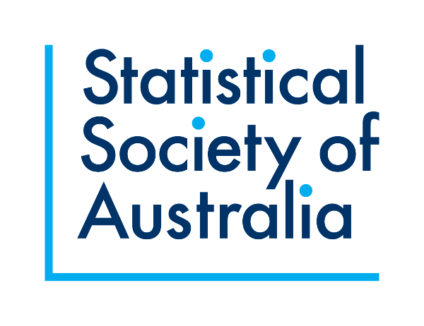
The Statistical Society of Australia (SSA) is going through a long process of rebranding. A key milestone was the adoption of a new visual identity, complete with a fresh, modern logo. We launched this on 18 May 2017.
I chaired the committee that commissioned and implemented the new identity. The design was created by A Friend of Mine and implemented by Marina Watson.
As well as multiple versions of the logo, the visual identity also includes a customised colour palette and typeface. We have created templates for letterheads, signs, banners and several other items. If you want any of these, or need to create SSA-branded items, please get a in touch with our Executive Officer to get a copy of our ‘brand pack’.
Elements of the logo design
The logo is based on a scatter plot, a simple, straightforward and popular data visualisation technique used throughout statistics. The elements of such a plot have been pared back to create a clean, understated look: the unadorned axes frame the text and the dots on the ‘i’s represent data points. The dots are also aligned in the shape of the Southern Cross, a subtle reminder of the fact that our society is Australian.
Old logo
We say goodbye to our old logo…


One thought on “New logo for the Statistical Society of Australia”