Category Archives: Uncategorized

Statisticians jump out of a plane

Last weekend, I joined four other statisticians in a skydive. We were treated to marvellous views of Melbourne as we floated down to the ground early on Saturday morning.

Some of our colleagues were disturbed to hear of our plans, and even thought it reckless to be putting so much local statistical expertise at risk! That got me thinking, how dangerous was it? Of course, I waited until after our skydive to look this up…

A convenient measure of this type of risk is a micromort: representing a one-in-a-million chance of dying due to a given event or activity. We can look back at historical data to get a rough assessment for any activity. For skydiving, it is about 8 micromorts. This is averaged across a large number of skydives. In our case, since we were jumping in tandem with very experienced instructors, I would guess our risk would be lower than this average.

How does this compare to other, more familiar, activities?

Running a marathon or doing a scuba dive are of similar risk to a skydive. As is riding a motorbike for 80 km (Melbourne to Geelong), driving a car for 3000 km (Adelaide to Darwin) or flying 13,000 km (Melbourne to Seattle). I don’t know if that would reassure my risk-averse colleagues, or terrify them to stay at home.

Some much riskier activities are BASE jumping (430 micromorts) and climbing Mount Everest (40,000 micromorts). I’m definitely staying away from these!

For more on this topic, I recommend Hassan Vally’s 2017 article in The Conversation on how deadly our daily activities are.


A version of this article was published in the 16 March 2023 edition of SSA’s weekly bulletin.

In for the count

As we close out another pandemic-afflicted year, I look forward to better times ahead. Like other parents with young children, I had to hit ‘pause’ on many things in 2021. However, I am glad to have received a last-minute Christmas present, in the form of a Discovery Project grant!

For the non-academics amongst you, this is funding from the Australian Government (via the Australian Research Council) for research projects. These are very competitive and given out only once per year. The success rate this year was 19%. See here for details and stats about all funded projects.

What’s our project?

Together with my colleagues Michelle Blom, Philip Stark and Ron Rivest, we will develop methods for auditing election outcomes. Our project is called In for the count: Maximising trust and reliability in Australian elections.

The idea is to do something much quicker and cheaper than a recount, by randomly sampling the ballot papers and statistical inferring the result. Methods to do this are already available for simple election systems such as first-past-the-post. However, our preferential elections in Australia are more complex and still lack rigorous audit methods.

Why do we need to audit?

Scrutineering is a key ingredient in the success of Australian elections. We have an excellent track record in this.

Unfortunately, our Senate election is being increasingly automated, in a way that has not allowed for proper scrutineering. Instead of the ballot papers being counted fully by hand, they are scanned and counted digitally, using computer systems that are not open to scrutiny in the same way.

Do we do any auditing already?

At present in Australia, audits of this type are not conducted. However, our research funding couldn’t have been more timely. Earlier this month, the Australian Parliament recognised the need for more scrutiny and passed a bill that requires various process for verifying the security and accuracy of the Senate election. This will include a random sample of the paper ballots, to compare against their digital version.

The requirements aren’t fully spelt out in the bill, and I won’t delve into the details, but suffice to say that the key step of sampling the paper ballots is a common feature in both the bill and the methods we envision developing.

These requirements will kick in at the next federal election, which is now only months away. It’s exciting that our research topic will be of such immediate relevance.

Where is that Lego brick?

Last year, my kids and I enjoyed assembling the Lego Gingerbread House. It was a dream Christmas present.

After carefully packing it away, we unveiled it again this year as a fun Christmas activity.

With almost 1500 bricks, some of them proved quite elusive to find! We poured them all out on a tray and combed through them thoroughly. Many. Times. Over.

If this was a random box of Lego bricks, at this point I would give up, confidently declaring that our desired bricks were absent. But I persisted. I knew those bricks were here somewhere.

A few minutes later…success!

My Bayesian self congratulated me on not letting the wealth of data overwhelm my highly accurate informative prior.

How to rate restaurants

I am a frequent user of Zomato, and its predecessor Urbanspoon. I use it to find good places to eat and I also give back by providing my own ratings.

In the beginning, I would sometimes spend a while mulling over what rating to give. My dining experience is often multifaceted and I am forced to distil it to a single categorical rating, or even just a binary rating in Urbanspoon’s case! What if the food was delicious but the service terrible? The venue well designed but very noisy due to construction across the road? If I enjoyed my meal but thought it was overpriced?

I certainly can’t convey all of that nuance with a single rating. As a result, if I feel like I need to say something specific I will actually write a short review. However, I also want to make my numerical rating as meaningful as possible. What’s the best approach?

Would you recommend it?

I decided to think about how my ratings would be used by others. When I look up a restaurant, I am interested in one thing: should I dine there?

To rate the places I visit I answer that question directly. Namely, would I recommend it to a friend?

Back when Urbanspoon was in existence, that was it. The answer would be a straight ‘yes’ or ‘no’, and I was done. Easy, straightforward.

I was surprised how much easier my job became simply by framing a clear, actionable question. Urbanspoon was already as easy as you can get, allowing only a binary rating. Nevertheless, without the clarity of a question I was sometime still unsure of how to rate some places.

Beyond binary ratings

When Urbanspoon got taken over by Zomato, I was sad to see the elegantly simple binary ratings replaced by a messier 5-star system. I was once again in limbo. I needed a framework for giving clear, consistent, meaningful ratings on a 5-point scale. Here’s what I came up with.

I ask myself the following questions:

  1. Was I generally happy with the food and service?
  2. Would I recommend this place to a friend?
  3. Would I come back again?

Any restaurant that got a ‘yes’ for the first question starts with a rating of 3/5. Each extra ‘yes’ for the next two questions gets an additional 1/5. If the answer to the first question is ‘no’ (in which case, all of them will be ‘no’), then I will rate it 2/5, or bump it down to 1/5 if the experience was so terrible than I think the place should be forcibly shut down.

With this framework in place, I find rating restaurants straightforward once again.

Perhaps Zomato should implement a system of questions like this, rather than letting people give arbitrary numbers from 1 to 5?

New website for the Statistical Society of Australia

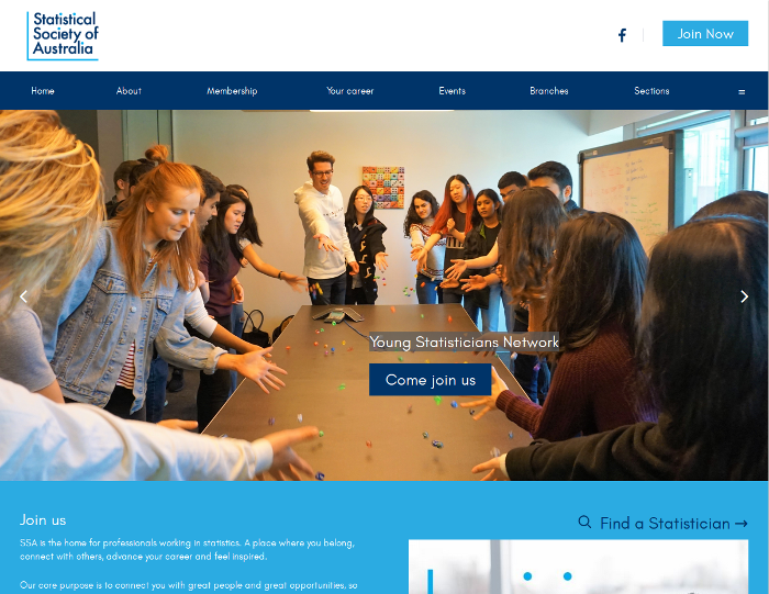
Following in the footsteps from last year, the Statistical Society of Australia (SSA) continued rebranding by launching a new website on 4 Dec 2018.

I have been actively leading the committee that commissioned and implemented the new website.

The website was designed by Converge Design and is hosted using the Wild Apricot association management system.

More than a website

Moving to a new website ended up taking us more than a year. A website is a central point of information and interacts with many other systems. Finding an appropriate platform to use that suited our requirements and budget was a complex task.

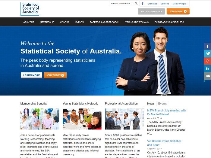
Our initial motivation was to update the look and feel of the website. In doing so, we also made substantial changes ‘under the hood’. We now have a completely integrated system for managing our membership database, events calendar, email announcements, billing and, of course, our website. This should make many of our administrative tasks much easier going forward.

Old website

We say goodbye to our old website…

Congratulations Alison Harcourt

This article was first published in the SSA November 2018 eNews under the title “Well-deserved recognition for Alison Harcourt’s tireless dedication to mathematics and statistics”, written by Damjan Vukcevic & Karen Lamb.

In the last newsletter, SSA reported on the ABC 7.30 program which featured SSA member, Alison Harcourt, and her inspirational career in mathematics (see also the accompanying story on ABC Online).

We are delighted to hear that since then Alison has been named Victoria’s 2019 Senior Australian of the Year. This award recognises Australians in Victoria aged at least 65 years who are still actively contributing and achieving in their work; this is certainly true of Alison. To this day she continues to train new generations of mathematicians and statisticians and has been a mentor to many great statisticians who have long-since retired!

The accolades continued for Alison who was also awarded an honorary Doctor of Science by the University of Melbourne. In addition to her dedication to training and mentoring, these awards recognise Alison’s remarkable achievements. The most visible ones include her seminal paper on the “branch and bound” method, her contributions to quantifying the extent of poverty in Australia and her work that led to the introduction of the “double randomisation” method in allocating positions on ballot papers (still in use today). Given that Alison was working at a time when there was much less support for women, this sort of recognition is well overdue.

Finally, we must mention that Alison was the founding secretary of the Victorian Branch of SSA, back in 1964. It is great to see her still attending our branch meetings regularly and supporting the society.

The Australian of the Year Awards are awarded to “leading citizens who are role models for us all”. Alison is definitely one of those. Congratulations Alison!

Your first R package

Today I gave a short talk about writing R packages at the Research Bazaar 2018 (University of Melbourne). I’ve made my slides available online.

The talk is aimed at R beginners. I assume you already know how to write basic functions and want to take the next step and learn to put these together into packages.

If you are a more advanced R user, I recommend starting with my much longer talk about R packages that I presented at the Melbourne R user group in 2016.

New logo for the Statistical Society of Australia

I was reflecting on the important events of the year for me and was surprised to notice that one of them seems to have gone completely undocumented.

The Statistical Society of Australia (SSA) is going through a long process of rebranding. A key milestone was the adoption of a new visual identity, complete with a fresh, modern logo. We launched this on 18 May 2017.

I chaired the committee that commissioned and implemented the new identity. The design was created by A Friend of Mine and implemented by Marina Watson.

As well as multiple versions of the logo, the visual identity also includes a customised colour palette and typeface. We have created templates for letterheads, signs, banners and several other items. If you want any of these, or need to create SSA-branded items, please get a in touch with our Executive Officer to get a copy of our ‘brand pack’.

Elements of the logo design

The logo is based on a scatter plot, a simple, straightforward and popular data visualisation technique used throughout statistics. The elements of such a plot have been pared back to create a clean, understated look: the unadorned axes frame the text and the dots on the ‘i’s represent data points. The dots are also aligned in the shape of the Southern Cross, a subtle reminder of the fact that our society is Australian.

Old logo

We say goodbye to our old logo…

Genetics & life insurance

I spoke at the Actuaries Summit yesterday. Together with Jessica Chen, a friend of mine who works as an actuary, we presented a paper that summarised the latest genetics research and what impact it might have on the life insurance industry. Our work generated a lot of interest and was even picked up by the Australian Financial Review!

Update (30 Jun 2017): A recording of our talk is now available. Also, yesterday we published an article in Actuaries Digital describing some of the highlights.

Explaining the benefit of replication

It is well known that replicating a scientific experiment usually leads to a more conclusive result. One way in which this happens is that the statistical evidence becomes stronger when it is accumulated across many experiments. What is perhaps surprising is that describing and quantifying how this happens is not straightforward. Simple explanations can easily be misinterpreted if they gloss over key details.

Confusion due to ambiguity

One explanation I heard recently went roughly as follows:

Suppose we run a single experiment, using the conventional 5% level of statistical significance. A positive finding from this experiment will be wrong 1 out of 20 times. However, if we were to run three experiments instead of just one, the chance that all of them would be wrong would be 1 in 8,000 \((= 20^3)\).

The fact that is being explained here is that the false positive rate is decreasing. That is, if we assume the underlying research hypothesis is actually false, the chance that a single experiment will come out positive (i.e. will support the hypothesis based on a statistical test) is 1 in 20, and the chance that all three experiments will do so is 1 in 8,000.

However, most people are likely to interpret the statement differently. They will mistakenly think that the chance the research hypothesis is true, given a positive finding, is 1 in 20.

The difference is somewhat subtle. The first interpretation refers to the probability of the experimental outcome given an assumption about the truth of the research hypothesis. The second is the reverse, a probability of the hypothesis given an assumption about the outcome. The two can easily be confused, giving rise to what is known as the Prosecutor’s fallacy.

The main problem is the ambiguity of the phrase ‘will be wrong’, which can be interpreted in different ways. Most people would naturally focus on the main question of interest (‘is the hypothesis true?’) whereas classical statistics is usually posed in the reverse manner (‘what is probability of the data given the hypothesis?’). We can attempt to fix the explanation by more precise wording, for example:

Suppose we run a single experiment, using the conventional 5% level of statistical significance. If the research hypothesis is not true, the experiment will give rise to a positive finding by chance 1 in 20 times, while with three independent experiments the chance that all three would be positive goes down to 1 in 8,000.

While this is now factually correct, the message has become a bit harder for a lay audience to understand or relate to. They will want to know how replication helps to answer the question of interest. They may even impose their own interpretation of the probabilities despite the careful wording. Prosecutor’s fallacy still lurks in the shadows.

More meaningful explanations

To help such an audience, we can frame the explanation directly in terms of the chance that the hypothesis is true. This requires some extra information:

  1. The statistical power of the experiment (also known as the sensitivity or the true positive rate). This is the chance that it will give a positive result if the research hypothesis is true.

  2. The prior probability of the hypothesis. This is our best assessment of whether the research hypothesis is true before having run the experiment, summarised as a probability. (This can be based on other evidence already gathered for this hypothesis, or on evidence or experience from studies of similar or related hypotheses.)

After we conduct the experiment, we can combine the outcome and the above information together using Bayes’ theorem to determine the posterior probability of the hypothesis. This is our ‘updated’ assessment of it being true, in light of the evidence provided by the experiment. It is this quantity that is of most interest to the audience, and how it would differ if replicate experiments are conducted.

For example, suppose we wish to run a psychology experiment that is somewhat under-resourced and we have assessed the power to be about 20%. Furthermore, let’s suppose we are testing a speculative hypothesis and rate the chances of it being true at about 1 in 10. A positive finding in this case would upgrade this to about 1 in 3 (a posterior probability of about 33%), which still leaves plenty of room for doubt. If we replicate the experiment two more times, and get positives each time, then the overall posterior probability would be almost 90%. This would certainly look more convincing, although perhaps not completely conclusive.

In comparison, suppose we are planning a clinical trial with a power of 80%. We will test a drug for which we already have some evidence of an effect, rating the chances of this being true as 1 in 3. A positive outcome here already entails a posterior probability of almost 90%, while positive outcomes for three independent such trials would raise this to more than 99.9%.

Note that in both of these examples I have assumed the experiments would be designed to have a 5% false positive rate, as is commonly done. That means for both examples the false positive rate for three experiments is 1 in 8,000. However, the quantifiable impact on the actual question of interest varies.

Recommendations

The above examples show how to explain the impact of replication on the statistical evidence in a way that is more understandable than if only referring to the change in the false positive rate.

I recommend using an example along these lines when communicating the benefit of replication. Tailoring the example to the audience’s interests, including using assumptions that are as realistic as possible, would allow them to more easily see the relevance of the message. Even for a fairly general audience, I recommend describing a hypothetical experiment than referring to generic statistical properties.

Setting up this type of explanation requires some elaboration of key assumptions, such as power and prior probability, which can take a bit of time. The reward is a meaningful and understandable example.

While it might be tempting to resort to the ‘1 in 8,000’ explanation to keep the message brief, I recommend against it because it is likely to cause confusion.

If brevity is very important, I recommend steering away from numerical explanations and instead just describing the basic concepts qualitatively. For example, ‘replicating the experiment multiple times is akin to running a single larger experiment, which naturally has greater statistical power’.